SmartCMS
Jump to navigation
Jump to search
Contents
Getting Started
If you are just getting started with the SmartCMS, watch this overview video. Otherwise, just scroll down for more videos and SmartCMS user help.
| Add Menu Item |  |
 |
| Edit a Menu Item | |
|
| Enable/Disable a Page | |
|
| Modify Page URL | |
|
| Add Text to a Page | |
|
| Add Content Style | |
|
| Delete a Page | |
|
| Change Background Image | |
|
| Updating Site Colors | |
|
| Banner Ads | |
|
| Adding a PDF | |
Workshop Videos
| SmartCMS 101 Workshop | |
Advanced Tips
Create Module Page Custom Templates
Managing Your SmartCMS Site
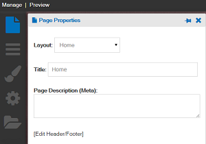
The Page Properties Box

The Page Properties box allows for updating of individual settings for each page.
- Published: When the Published checkbox is checked, the page content will be visible and live on the internet. If the Published checkbox is unchecked: when you are logged into your website, you can see the page; individuals viewing the live website won’t be able to see the page. Scheduled Publishing (Pro Edition) is available with the ability to select dates, times and time zones for the page to be published.
- Title: The title text that displays in the browser tab can be changed in this section.
- Page Description (Meta): The Meta Page Description describes what can be found on the page. We recommend adding a short description to all the pages created, as search engines look for this to display on search engine results pages.
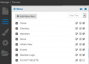
The Menu Box

The Menu Box is where you can make additions or changes to the main menu.
- One Tier Menu or Basic Mega Menu can be selected. Both options display optimally in mobile devices.
- One Tier Menu – The sub links will display in a one tier dropdown format
- Basic Mega Menu – For websites that have many links, the Basic Mega Menu provides grouping of links while organizing the links in sections, all in an optimal display for multiple devices.
- By clicking on Add Menu Item, you are able to add a new navigation or page. Here you will be able to create a new page, dropdown menu, Module link, or external link. The same navigation options will display if you click the “+” box next to the menu heading titles.
- For a New Page, type in the desired title, make sure the New Page is selected, and click save. A dialog box will appear with page options. A new page creation will automatically create a Heading 1 title for the page. Heading 1 titles are an important SEO element.
- For a new menu title, select Dropdown Item and hit save. The new title will automatically display in first in the menu. You can now drag the menu title to preferred location. Menu titles can be edited, disabled, or deleted to the right of the title. Clicking the “+” on the left hand side will expand the dropdown to show the pages within the main menu item.
- To add a Module page, type in the title of the page, selected Module and then use the dropdown menu to select a module before clicking save. Modifications can be added to the module link to add extra parameters.
- Select External Link to add a page title and hyperlink. You have a choice to have the link open in a separate tab.
The Appearance Box
The Appearance box allows you to customize the colors on the website and change the background.
- Primary, secondary, and optional third colors can be chosen. Appearance Profiles can be created for different design ’looks’ for your website. These settings are then saved as their own profile with the current date and time. This allows you to easily change back to what you had at a previous point in time. Example profiles could include holidays, special events, or a brand color change for your association.
- The background color can be selected along with different design options. A photo or design pattern can also display as the background. A photo can be uploaded by browsing to the cloud and selecting a photo. A full-width display or repeating option is available. Recommended minimum photo size for full width display is 1024px wide x 768px high.
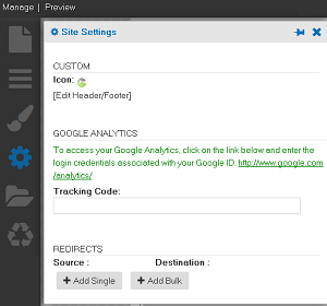
The Site Settings Box

The Site Settings box shows site wide settings for your website.
- Add/change the favicon. The favicon is the small image that shows in your browser tab.
- Custom code, such as html or Javascript, can be placed in the header/footer area by clicking that link.
- Your Google Analytics ID is added for tracking traffic on your website, and a link to login to your google account to see your analytics.
- Page redirects are also managed in this area.
Features of SmartCMS
Content Options
- Text
- When adding Text, a full selection of editing tools are available in the editor, including text formatting, adding of hyperlinks, and adding of images.
- Text Content Styles: Available to add design interest to your content is the Content Style feature. Content Styles can be added to the text area by clicking the Content Style checkbox. Different selections for style, color, and icons are available. The content can be previewed before saving.
- When adding Text, a full selection of editing tools are available in the editor, including text formatting, adding of hyperlinks, and adding of images.
- Image
- Through Image, you can upload a single image with the option of adding a link. These images will automatically be responsive. Alignment and hyperlinks can also be applied to the photos.
- HTML
- The HTML content option is used to add HTML code to a content area. The ‘Editor’ view can be selected to display the html content if desired.
- Slider/Gallery, File Manager
- Add a slider of images, or a photo gallery to your website through Slider/Gallery.
- The recommended size for slider images is 1172px wide x 390px high for optimal display in a full width of an Area. Captions can also be added to the slider images. Transitions can also be applied for the photo sliders, which include fading, horizontal, and vertical sliding. Hyperlinks to text and to photos can also be added.
- You can add a photo gallery to display a collection of photos from your file manager. These images will display three across in thumbnail size. Once clicked on, the full image will display along with a caption if added.
- Photos can be added in the file manager to use for the photo gallery and slider features. Click ‘Add image’ to go to the file manager to select your photos.
- Add a slider of images, or a photo gallery to your website through Slider/Gallery.
- File Manager
- The file manager allows for multiple file upload to the cloud, as well as the ability to select multiple files and move them into a designated folder, using CTRL Click to select the files. Uploading a file to the file manager is accessible through the Content Options ‘Text’, ‘Image’, and ‘Slider/Gallery’ options. 50mb individual file size limit. No limit on the total file size of all files.
- ChamberMaster/MemberZone Widgets
- Add Widgets to display information from your database with the ChamberMaster/MemberZone Widgets. These include:
- Blog
- Blog Index
- Events Calendar
- Login
- Forms
- Sponsored Ads
- Module Feed – these will automatically display as the primary color and scrolling.
- Members - New
- Members - Featured
- Events - Upcoming
- Events - Featured
- News Releases
- Add Widgets to display information from your database with the ChamberMaster/MemberZone Widgets. These include:
- Site Search
- Choosing Search will add a search box to the content area. When a word or search words are typed into the search field, a dropdown will display with pages and/or members matching the search term.
- Custom Links
- Custom Links are available for creating secondary menus in horizontal or vertical display. The custom links can display with or without icons. Hyperlinks and alignments can also be applied to the links and a preview is available.
- Icon Library
- Add icons, such as Module, Category, Social icons, or upload a custom icon from the file manager to a desired content area. Standard Glyph icons are available as well. Icons are displayed horizontally, and a preview is available. Titles, hyperlinks, and alignment can be applied to all icons. Font Awesome Icons (Pro Edition) are also available for Pro Edition users.
- Widget
- The Widget (Pro Edition) option gives you a way to group information together using advanced widgets like the tabs or accordion style widget. This is available to Pro Edition users.